How to Choose Exterior House Colors: Top 5 Tips from a Color Pro
After providing guidance to hundreds of homeowners choosing exterior house colors, I know that even a tiny bit of knowledge can go a long way toward ending your frustration when choosing exterior house colors. Today, I’m sharing my top five tips for selecting color.
You will learn why understanding color characteristics makes finding the right color more manageable. This, in turn, makes selecting your exterior colors easier.
Find the right exterior house color
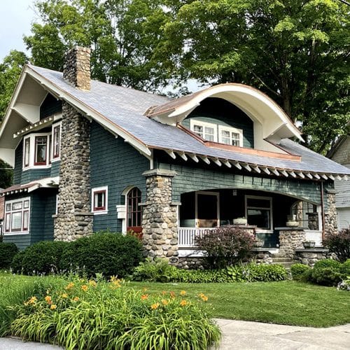
This home featuring DaVinci Single-Width Slate has chosen colors where the hue, value, and intensity work nicely together.
Please don’t click away because you think I’m about to get all technical on you. I’m not. You already describe color in terms of hue, value, and intensity, but use different words. If you’ve ever said paint is light blue-gray or bright, medium orange, you’ve expressed all three of these attributes.
- Hue is the same as color. It is what you see when looking at any surface.
- Value is how light or dark it is, and
- Intensity indicates whether the color is bold, vibrant, muted, neutral, or somewhere in between.
Tip 1: What Color Do You Have in Mind?
Begin by identifying a general color direction. It’s best to start with just one option. I’ll tell you at the end how this makes the entire process easier. For now, trust me, and pick one color. Relax, you’re not committing, just considering it.
If the first color you want to look at is green, the next step is to decide whether to look at dark, medium, or light green.
Tip 2: How Light or Dark a Color Do You Prefer
Go with your first thought. Any lightness or darkness of your selected color is an option. You can look at a lighter or darker shade once you follow the next tip with this color.
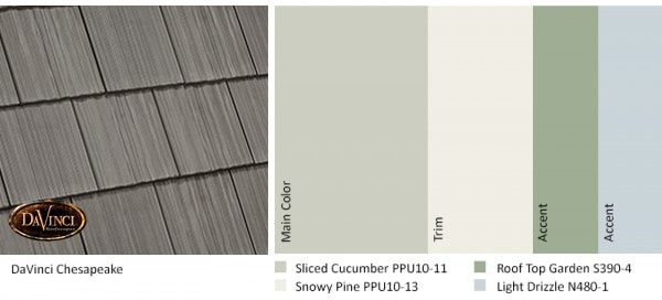
Light or medium green primary or accent colors are an excellent choice if your roof is DaVinci Chesapeake.
Tip 3: Getting the Color Just Right
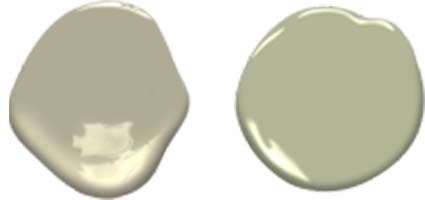
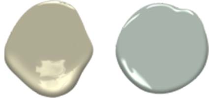
Some colors, especially primary exterior house colors, are less intense. You might describe them as neutral, toned-down, soft, muted, subtle, misty, dull, or dusty. Higher-intensity colors are clear, pure, brilliant, bright, rich, bold, or vivid. These saturated shades are perfect for front doors and shutters but are usually too colorful to be the primary color in a scheme. Is your desired color almost neutral or more colorful?
A lower intensity or muted version of the color will generally give you better results when selecting exterior colors. The primary color in the scheme shown above has a medium to dark value (lightness or darkness) and a lower intensity than the green used as an accent color.
Tip 4: Consider Other Colors
Here is the significant benefit of using my first three tips. Once you have found the first color you like, finding a second, third, or tenth option becomes easier. You don’t have to go through the entire process again. Your first color is the starting point for any others you wish to consider.
For example, if your first option is Benjamin Moore Nantucket Gray, a stylish gray-green reminiscent of fog settling over grassy fields, use that to find the next color.

Scan the available colors from Benjamin Moore with a Nantucket Gray swatch in hand to find a similar shade, only lighter. Paris Rain is similar and lighter, or you could go much more lightweight with Hazy Skies.
What if Nantucket Gray seems too neutral? Urban Nature also has a healthy dose of gray but shows more of its green side.
Do you want to look at blue-green, too? Look at shades with similar values and amounts of gray mixed in. Raindance seems about the same but in the blue-green range. You can even use your first swatch to find options in another color family.
I often use this process when helping customers select their DaVinci Slate or Shake composite roofing tiles. If they like silvery brown Weathered Gray Shake but think it isn’t dark enough, I suggest they look at Mountain, a deeper gray-brown, or Mossy Cedar, brown with an earthy gray patina.
Always Confirm Your Color Choice
If you see a home painted in a way you love and then ask the homeowner what colors they choose, you might be surprised at how different their color looks on a small paint swatch. The difference between how a color appears when you see a small sample and what it looks like when applied to a home is why sampling each color is essential. Sampling is the only way to confirm you’ve made the right choice.
Looking at samples is the last step in selecting your colors. Buy small containers of paint and apply to a sturdy board or plywood. Then view samples of the colors alongside the home in the front and back of the house. Stand back about 15-20 feet to determine if you are pleased with how your colors look. Be sure to look at each color over a few days at different times to see how it seems as the natural light changes throughout the day.
When looking for a new roof, you should do the same thing. Ask your roofer — or call DaVinci Customer Service — for different samples of the roofing colors you like best. Place them either on your roof or alongside your home. View them for several days during different times to see which colors you like best.
More Tips for Choosing Exterior House Colors
The five tips above may be all you need. However, I’ve written several ebooks if you want additional guidance. These ebooks offer easy-to-follow processes for choosing the colors for every part of your home. Download a free ebook.
Another excellent tool is DaVinci’s Color Visualizer, which lets you see exterior products and colors that complement your entire home. I recently wrote a color visualizer blog post you might find helpful, or you can go directly to the Color Visualizer and start coloring your home.
About the Author
Kate Smith is an internationally recognized color expert, consultant, and designer. She is a skilled colorist & a color consultant who, for more than a decade, has lent her expertise to DaVinci Roofscapes. Kate helps YOU select colors you will love for many years.