Your Home Is Telling You the Best Exterior Colors to Use. Are You Listening?
People often lament that choosing exterior colors is so much more complicated than picking colors for an interior when just the opposite is true. When choosing interior colors, there are so many factors to consider. When it comes to exterior colors, the process is much simpler because your home will tell you which colors will look best. All you need to do is learn how to tune in and hear what your home is saying.
Just as in any good conversation, listening is a big part of the equation, and the same is true when choosing colors for your exterior. To get the conversation started, begin by asking these questions and listening to how your home responds. The answers will be the clues to your perfect exterior colors and will be true whether you are deciding on the blend for your sustainable roofing system or the color for your front door.
Question 1: What parts of the exterior are long-term or permanent?
Look at the fixed features of any attractive home, and you’ll begin to see some repetition of tones. These include brick or stone facades, stairs, retaining walls, or even the roofing material. What color or color cast do these features have in common? Repetition of the color cast allows different materials and textures to all work well together.
For a home with a full or partial brick exterior, let the color cast of your bricks be your starting point. The tones in the roof and brickwork must complement each other. Then for the other elements, find colors that harmonize with the color cast of the bricks and roof to create the best look.
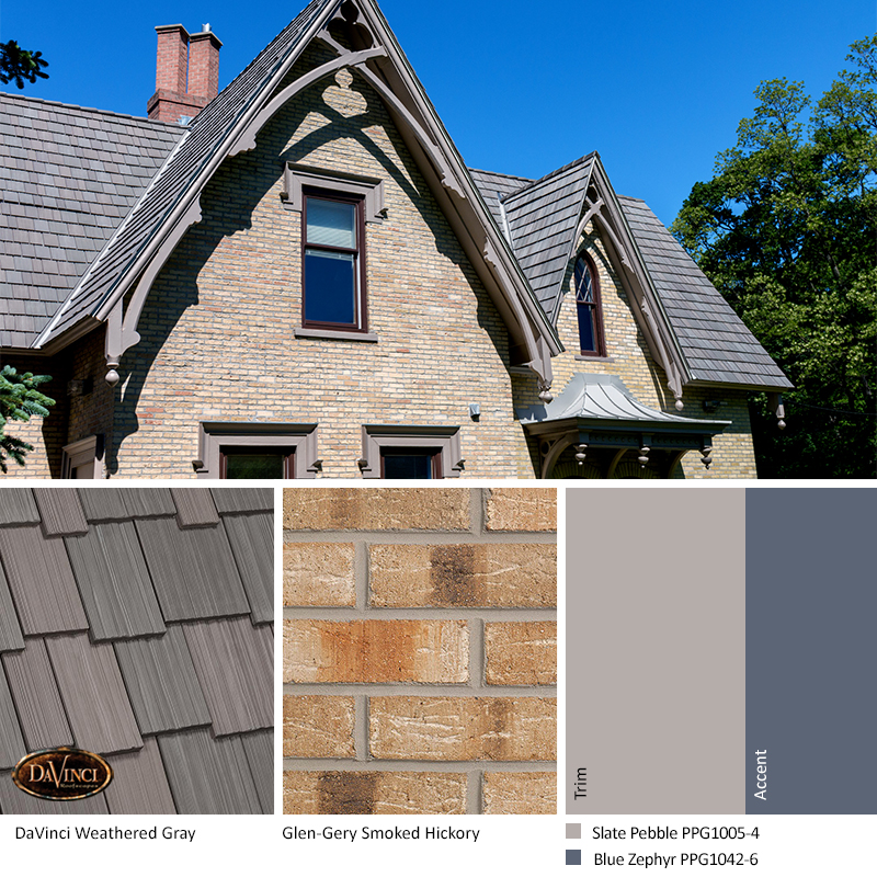
Tan bricks with Weathered Gray DaVinci Shakes create a harmonious exterior color scheme. You can find more details on how to coordinate colors with you fixed featured:
- Brick Home Exterior Color Schemes
- Stone Exterior Color Schemes
- Selecting Roofing Colors to Complement Brick and Stone Exteriors
Question 2: What colors are commonly used in my region?
Every region of the country has colors that define the area. In lesser populated areas, it is the colors of the natural surroundings. Cities, towns, and neighborhoods are more often determined by the colors of the exterior of the homes and buildings. These colors come together to form a palette that is unique to the area.

DaVinci shake in the Chesapeake color can be the perfect roof for a bungalow-style home in Orange County, California. Combining Coventry Gray and Burnt Ember serves as a complement to the surrounding coastal waters and beaches, while the Chantilly Lace trim helps capture the charm of these homes.

Chesapeake also was the right choice for a beach home in Long Island, New York. The soft taupe tones of Chesapeake are perfect to “top off” thousand oceans trimmed with Stonington gray and accented with Boothbay gray….of course, if desired, you can always add a bit of “wow!” A bold color door such as pottery red or gentleman’s gray are also options for this scheme.
Question 3: How should the home respond to its surroundings?
Look around your neighborhood or city; what types of colors do you see? Are the colors classic combinations or beachy brights? You want your home to stand out, but it still needs to fit into the area where you live.
You don’t want to have “that house” in your neighborhood. Even if the colors work together, if the scheme clashes with everyone else’s home, it will stand out — not in a good way. If your color palette doesn’t seem at home in the neighborhood, it could bring down its perceived value. To maximize your property values and maintain goodwill within your community, select an exterior color scheme that stands out while still finding in among neighboring properties.

Acme English Cobblestone and DaVinci Castle Gray Slate are a classic combination that always fits in. With a monochromatic palette for the body and trim, you can add personality with accent colors. This homeowner spiced it up with a warm color on the front door.
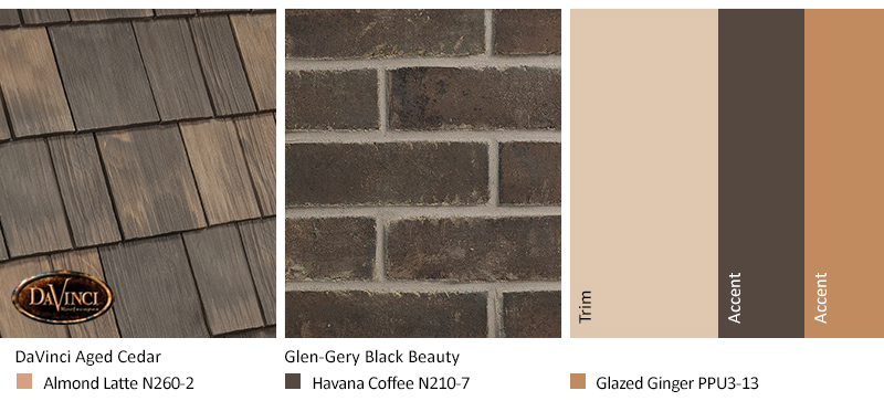
Taupe, beige, and tan with an Aged Cedar roof create a tonal background for dark brick. Almond Latte with dark Havana Coffee trim and a bright front door add color with a striking scheme that stands on its own while complementing the surrounding homes.
Question 4: What is the style of your home?
How have colors traditionally been used on this type of home? For example, is it more common to see light siding with dark trim or vice versa?

Yellow is a color that gives a Bungalow or Cape Cod style home a sunny and fun personality. Golden yellow and brown are perfect partners. Mountain roof tile on top of the gold-tone paint gives an upbeat, welcoming tone without drawing away from the natural surroundings. Bright yellow would call too much attention and is best in more tropical settings. The brown, almost purple accent color compliments the main color beautifully. This color-rich color in brown from a distance will illuminate with purple undertones up close on the front door.
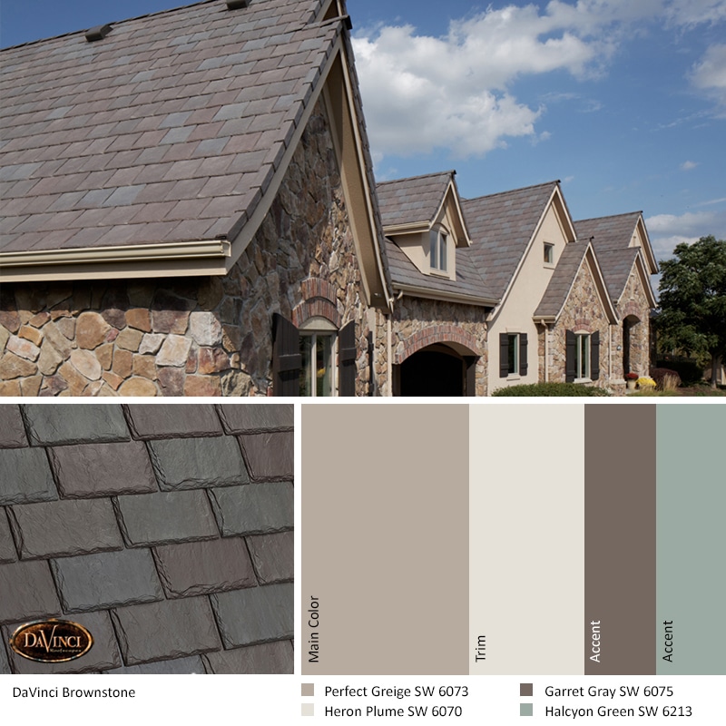
An old-world home with a Brownstone slate roof would usually have a more traditional scheme built around a neutral main color. The warm gray tonal scheme with a cool muted green front door creates the refined look befitting this house style.
Picking A Perfect Color Scheme For Your:
Question 5: Are there any restrictions to the colors you can use?
Does a Homeowners’ Association or Historic District limit your choices? If so, ask if there are pre-approved colors or if you are free to make your own selection. Ask them if there is any guidance they can give you on color selection based on their experience. Their answer may give you more insight on how to have your plans accepted than any written guidelines. It is well worth your time to ask.
You may think that if you have pre-approved colors that all you have to do is pick one and done. Not so fast. Even if the color is pre-approved, it might not be approved for your home if it is identical to your neighbors. Look around and make sure your colors don’t mirror another home close by.
If you are on your own for choosing colors, look for colors that will express your personality or give your home a unique look but don’t deviate too far from what is the norm for your neighborhood. The ideal color scheme stands out while still fitting in. If you keep that idea in mind as you select your color scheme, you’ll be well on your way to getting an HOA approval for your plans.
- How To Get Your Colors Approved By Your HOA: Quickly and Easily
- Tips for Working with Your HOA to Get Your Roof Approved
About the Author
Kate Smith is an internationally recognized color expert, consultant, and designer. She is a skilled colorist & color consultant who for the past decade has lent her expertise to DaVinci Roofscapes. Kate helps YOU select colors that you will love for many years to come.